Designing Your First Motif Collection: A Beginner's Guide for UK Makers
A first motif collection rarely arrives fully formed. It usually begins with a scrappy sketch on the back of an envelope, a favourite fabric scrap, or a walk past a hedge you have passed a hundred times and only now noticed properly. The trick is turning that spark into something usable — a set of designs that sit together on a page, a shelf or a length of printed cotton without looking like strangers at a party.
What follows is a workable process for makers working at a kitchen table rather than in a studio: choosing a theme, sketching loosely, and assembling a set that holds together.
Start with a theme that can carry eight to twelve motifs
The most common first-collection mistake is choosing a theme that is either too broad or too narrow. Botanical is too broad: it gives you no reason to choose one leaf over another. Oak leaves in autumn is closer, but may leave you short by motif six. The sweet spot is something specific with room to wander — "herbs growing on a south-facing windowsill", "mending tools and thread", "birds seen from a suburban train".
A quick test: set a timer for ten minutes and list everything the theme could include. If you reach fifteen items without cheating, it will carry a collection. If you stall at five, widen it. If you have forty and no thread between them, narrow it.
It also helps to know where the collection will live. A set destined for embroidery needs shapes that read as line; one headed for wallpaper needs motifs that repeat without obvious joins. Deciding this early saves redrawing later.
Gather references, then choose a palette
Collecting comes before drawing. Spend an evening building a mood board — twenty to thirty images, kept in one folder or pinned to one board, each with a note about what drew you to it. Not "nice colours" but "the way the stems cross", "the flat grey behind the orange". Those notes are what you will actually use.
Draw from life where you can. Photographs flatten shapes and hide structure; a real sprig of rosemary on the table shows you how the leaves attach, which is exactly the information you need.
Limit the palette to four or five colours
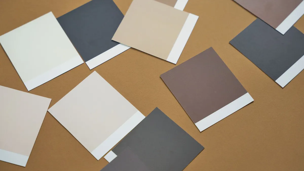
Pick one dominant colour, two supporting tones, and one or two accents. Give the dominant the most space in every motif and the accent the least. Mix values, not just hues: a collection built from mid-tone blues and mid-tone greens will look muddy however pretty the colours are individually. Photograph your palette in greyscale on your phone and check that the tones separate.
Sketch for volume before you sketch for polish
Early sketches are for finding shapes, not presenting them. Work small — a 5cm square is plenty — on cheap paper, and aim for quantity. Thirty versions of the same leaf will teach you more than one careful drawing.
Useful warm-ups:
- Draw the same motif from memory, then from life, then from memory again. Compare the three.
- Squint at your sketch. If the silhouette is unclear, the shape is not yet simple enough.
- Redraw one motif at 2cm, 5cm and 15cm, and note where it breaks down.
- Set a five-minute limit per motif. Speed silences the inner critic.
Refine with two rules: consistent line, simple shape
Consistency is what makes a group of drawings look like a collection. Choose a line character and keep it — a uniform fine line, a brushy tapered stroke, or a chunky outline with no interior detail. Mixing them is the fastest way to make a set look accidental.
Then simplify. Remove any detail that vanishes when the motif is printed at thumbnail size: tiny stamens, individual feather barbs. What remains should read instantly. Keep the details you cut in a separate file; they can become a supporting pattern later.
Assemble the collection in layers
A collection is not twelve equal motifs. It is a small hierarchy that repeats across the set. Most work well with:
- Two or three hero motifs — the biggest, most detailed designs, used sparingly.
- Four to six supporting motifs — simpler versions, often the heroes at a smaller scale.
- Two or three fillers — dots, sprigs and small marks that add texture.
- One or two coordinates — a stripe, a check or a scattered repeat built from the same shapes.
Keep the palette, line weight and level of detail identical throughout. Lay everything out on one sheet and step back. If a motif looks like it belongs to a different collection, either rework it or set it aside for the next one. Both are legitimate choices.
Test the set before you commit to it
Print your motifs at the size they will finally appear — 2cm for a badge, 30cm for a cushion panel — and look at them from across the room as well as close up. Tile the repeats and check the joins. Photocopy the sheet in black and white to confirm the shapes still work without colour.
Then show them to three people whose taste you trust and ask one question: what do these have in common? If their answers match your intention, the collection is doing its job. If they describe three unrelated sets, the palette or the line weight has drifted.
Keep the first collection small and finish it
Aim for eight to twelve motifs and stop there, even if ideas remain. A finished small collection teaches you more than an abandoned ambitious one, and it gives you something to show, sell or print. Date the sheet and keep your roughs — the rejected sketches are usually where the second collection begins.
Give yourself a few weeks rather than a few months, work in short sessions rather than long ones, and accept that the first version will be clumsier than the picture in your head. That gap closes with every set you complete.
Photo: Muisje / Pixabay