What Makes a Motif Work? 6 Principles of Scale, Rhythm and Repetition
A motif is the smallest unit of a pattern: one scallop, a single sprig of laurel, a four-petal flower, a chevron. Everything else — the repeat across a wallpaper, the grid on a tiled splashback, the border on a cushion — is that unit multiplied. Which explains a common frustration. A motif that looks charming sketched on its own can fall apart the moment it is set out across a room, while a plain little mark can become quietly lovely once it is repeated thirty times. The shape is rarely the problem. The way it is scaled, spaced, contrasted and stopped usually is.
Six questions will tell you most of what you need to know before you commit to print, tile or fabric.
1. Scale: the motif against the frame
Most of us judge a motif at exactly one size — the size it appears on a screen or a sample swatch. That is the least useful place to look. Scale is a relationship between the motif and the frame it lives in: a wall, a tabletop, a stair runner, a lampshade. A 4cm motif on a 30cm tile reads as a bold graphic. The same 4cm motif on a three-metre wall reads as a speck. Both are legitimate, but they will not feel like the same design, and the drawing that looked good in your hand may need enlarging or simplifying for the surface it ends up on.
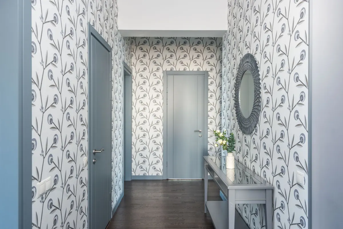
A useful rule of thumb: from the distance you will usually view the surface, you want to see at least three repeats and no more than about seven. Fewer than three and the pattern reads as isolated objects rather than a rhythm. More than seven and the eye stops reading individual motifs and starts reading texture. That may be exactly what you want — but it should be a decision, not a surprise.
2. Repetition: how many times, and to what end
The number of repeats changes what a motif means, not just how much of it there is.
A single motif is a stamp or a logo: it asks to be looked at directly. Two create a conversation, and a deliberate pair feels formal. From about three, the eye begins to anticipate, and anticipation is where pattern starts. Push past eight or nine and the individual motif dissolves; what you see is tone, movement and surface. Ask yourself which of those you are designing for. A motif meant to be admired wants space and a large scale. A motif meant to be a background wants small scale, low contrast and a lot of repeats.
Check the edges too. On a rug, a blind or a wall panel, motifs will be cut off. Partial motifs at the boundary look intentional when a consistent fraction is visible — a half, a third — and accidental when the eye keeps catching slivers of a quarter or less.
3. Rhythm: the interval does the work
Rhythm is about the gap, not the shape. Two versions of the same motif, spaced differently, will read as two different designs. Most work settles into one of a handful of rhythms:
- Even repeat. Equal spacing in both directions. Calm, architectural, forgiving. Suits small motifs and plain grounds.
- Half-drop. Alternating rows shifted by half a repeat. Softens the grid and is kind to larger motifs that would otherwise stack into columns.
- Alternating. Motif A, motif B, motif A. Creates a march and a stronger sense of direction. Good for borders and bands.
- Graduated. The motif grows or shrinks across the repeat. Charming on textiles, restless on walls.
- Irregular but balanced. The hand-blocked look. It takes far more motifs than you expect to avoid bald patches.
Whatever you choose, keep it consistent and then break it once, deliberately — a band of solid colour, a change of scale at the border, a single motif set on its own. A pattern that never breaks is wallpaper, and that is perfectly good. A pattern with one considered break becomes a composition.
4. Contrast: does it hold its ground?
Contrast is not only colour. It is line weight, tone, texture and sheen — a matt motif on a satin ground has contrast even if both are the same grey. The test is the squint: blur your eyes until detail disappears. If the motif and the ground merge into one flat mid-grey, the pattern will vanish from across the room. If it buzzes and flickers, the contrast is high enough to tire the eye over a large area.
A phone camera set to monochrome does the same job politely. As a rough guide, small motifs can carry bold contrast because there is less of them to look at; large motifs often want closer tonal values so the room is not shouting.
5. Direction and orientation
Rotate a motif ninety degrees and it becomes a different design. Rotate it 180 and a row of identical shapes turns into a chequerboard of alternating movement. Direction is the most under-used tool in a repeat, and one of the quickest ways to make a simple mark feel considered.
Watch for motifs with an obvious top and bottom — leaves, animals, letterforms, arches. They will create ladder-like rows with a strong vertical pull, which is wonderful in a hallway and slightly odd on a dining table. Mirrored pairs feel symmetrical and formal; a single rotated motif among upright ones feels almost botanical. None of this is a rule, but all of it is noticeable.
6. Restraint: the gaps are drawn too
The space around a motif is part of the design. In a good repeat, the ground is not leftover area — it is a shape in its own right, and it should be as deliberate as the motif itself. When you sketch a pattern, draw the negative space as carefully as the shape inside it.
Restraint also applies to ambition. One motif at a confident scale will almost always beat three motifs competing for attention. If you want two, give them a clear hierarchy: one large, one small, or one used only in a border. And be willing to simplify. Reducing an ornate motif to its three strongest lines often improves how it repeats, because repetition exaggerates detail you barely noticed once.
A five-minute test before you commit
Before you order samples, print or mock the pattern up at its final size, in the approximate material if you can. Screens flatter everything.
- Stand at the distance you will normally view it from. Count the repeats you can see.
- Squint, or photograph it in black and white. Does the motif still hold?
- Turn the whole thing ninety degrees. Does it read better or worse?
- Look at the edges and corners. Are the cut-off motifs deliberate?
- Walk away for an hour and come back. If your eye goes to the rhythm rather than to a mistake, it works.
Get those five right and the motif will do its job quietly for years — which is, in the end, the best thing a pattern can do.
Photo: Greta Hoffman / Pexels